
VIVE PRO Out-Of-Box Experience

Jun 2017 - Jan 2018 @HTC
To better design and evaluate the OOBE (out of box experience), a total of 1+7 rounds of design iterations were conducted, involving more than 60 participants who unboxed and set up the VIVE system either in a controlled lab environment or at their own locations.

PLATFORM
Website, Desktop Application, VR Headset
METHOD
Usability testing, Field study
REGION
Taiwan, United States
WHAT I DID
Set up goals and target users
Low-fidelity prototypes
High-fidelity prototypes
Usability testing
Guiding UX improvements
Creating guidelines for customer center
ACHIEVEMENTS
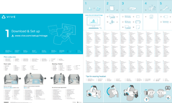
Designed a new form of paper guide and modularized packaging that intuitively directs users to download the software and locate the correct components.
Reduced the error rate of connecting HDMI cables to the wrong graphics cards. Even if this issue occurs, users can easily resolve it by watching a video tutorial.
The total time spent on VIVE setup decreased 26%. (from34 to 25 minutes).
The package design won Red dot Award: Communication Design 2018.
The findings from 8 rounds of testing were shared with the customer service team to enhance their script preparation for service interactions.
Overview
VIVE Out-of-box experience contains not only the box design, but also the other aspects, i.e., product website, quick start guide, software guide, and customer services.

Design Iterations
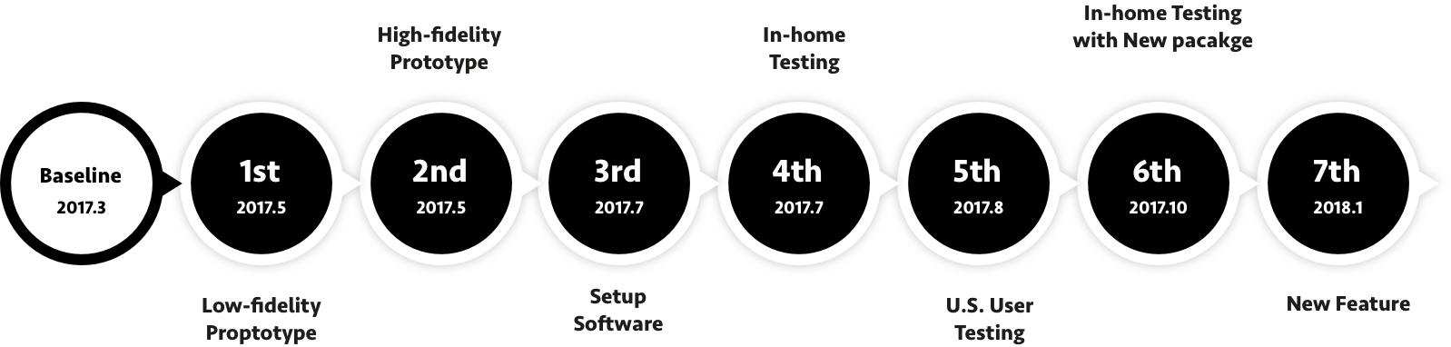
Eight studies had been conducted with 65 participants. We refined the setup software and instructions after each study.
Low Fidelity Prototype in 1st Round Testing (Tool: AxureRP)
High Fidelity Prototype in 1st Round Testing (Tool: Microsoft Powerpoint)
Challenge
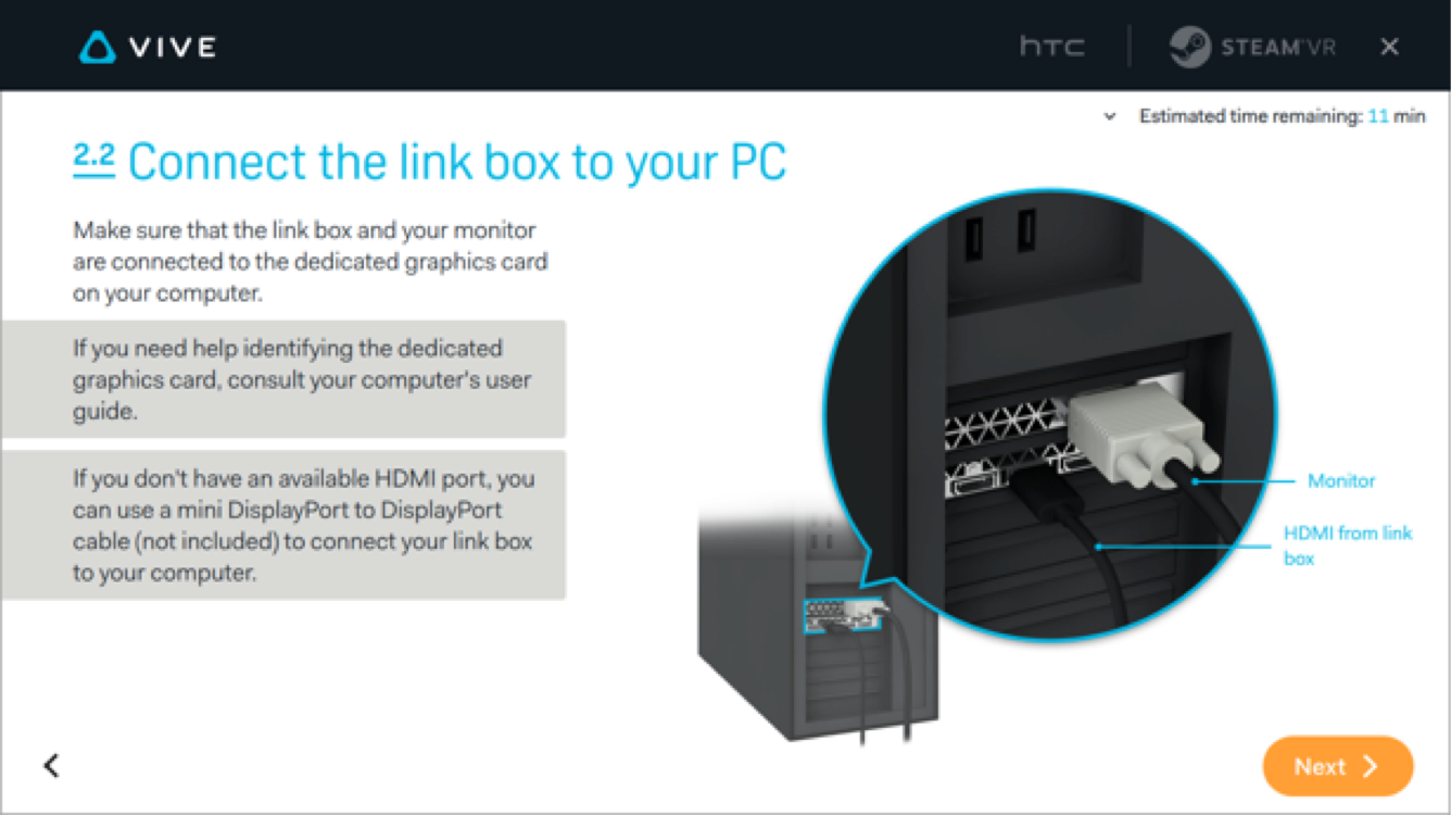
What is the dedicated graphics card?
When connecting the HDMI/DP cable, users didn’t pay attention to that it must be connected to the “dedicated” graphics card. This made the VIVE headset undetectable.
Solution
Highlighted both the right and wrong port and make the relative position of them more visible.

Added error handling cases into the later detection step.

Challenge
Every text on paper quick start guide has to be translated to 27 languages
Users didn’t download the setup software which contained the whole tutorial about how to install the devices. They either simply missed the original message “Get Started” or misunderstood it as an advertisement.
However, we couldn’t add more description into the paper guide because once it had been put on the guide, it had to be translated to 27 languages.
The crucial guidance (Get Started http://…) here was overlooked by the participants
Solution
Take 1: Make the term more specific
→Didn’t work 🥲

Take 2: Replace the text with diagram
→Partially solved 🤨

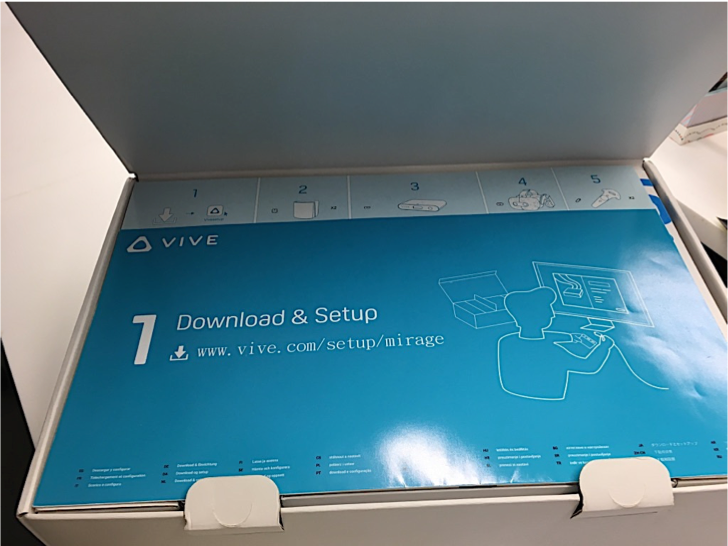
Take 3: Highlight the first step “Download” with diagram
→Solved 😄
Final Look (Prototype)
We made the information more visible by putting it on the first layer of the box (instead of the back of the lid). Then we used diagrams to guide users to download the setup software.
Added tags on the cable to help user address the right one easily.

Challenge
Taking everything out of the box made finding the right cable or component more difficult.
It can be seen in the testing that many users took everything out of the box, and that made finding the right cable or component more difficult.

Solutions
We grouped the main components and its cables by using the modularized box with the mapped paper guide.

As a results, when users unpacked the components from the box, they unintentionally grouped them together.
